

Best Ways To Pick Colors For Your Home | Easy Picks
Color Selection for Home
They Say the walls speak a lot. There is nothing more personal than a person’s choice of colour. When it comes to colour selection for homes, choosing a colour palette is both the most significant and the most difficult task. The color you choose can tell a lot about your personality and style. Choosing the proper house paint colours scheme is critical for creating a distinctive and essential impression in your home. with a basic understanding of wall paint colours, this work can be made simple, ensuring that you choose the proper interior paint colours for an eye-catching interior décor.
Below are some helpful hints on how to design a colour palette that best suits your style, personality, and way of life.
They Say the walls speak a lot. There is nothing more personal than a person’s choice of colour.
Color Selection for home schemes
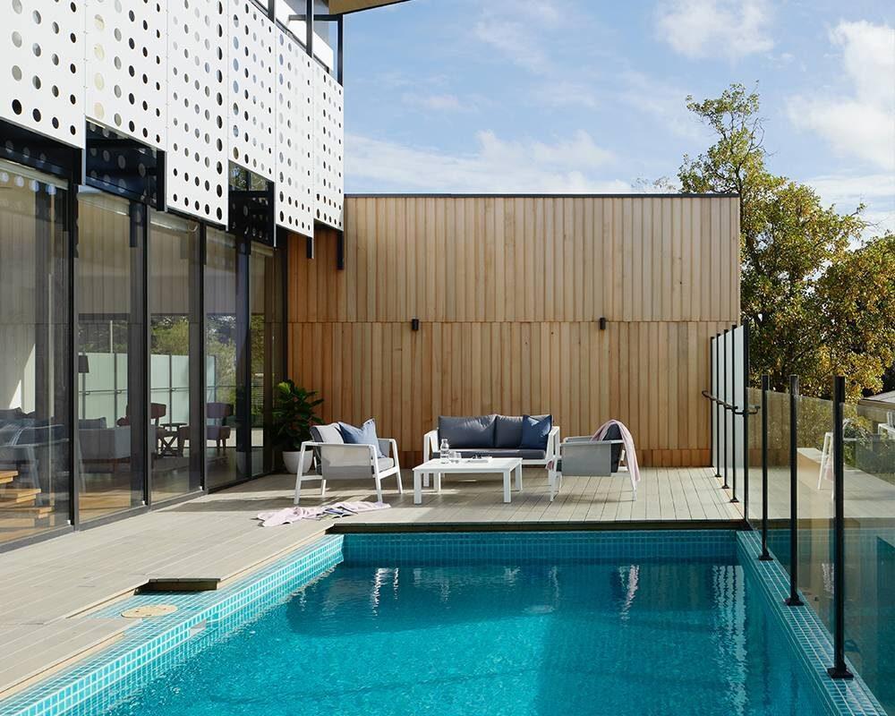
 We strongly advise against choosing your wall colour first. Wall paints are affordable, and they may be made in any colour or tint you like. It’s better, to begin with, goods that are more difficult to come by, such as furniture and rugs or carpets. After you’ve decided on your furniture, you may start thinking about the wall colour combination. You can decide that you’d rather have your colour in your accessories or furniture rather than on your walls. This is something that many people prefer. Others, on the other hand, like muted furniture with bold and strong walls. Everyone has their preference in home painting ideas.
First, choose the colours that best suits your personality and lifestyle. Once you decide on the colour combination, half of the work is done.
Four Different Color Schemes

Monochrome
Monochromatic– Monochromatic colour schemes are created by extending a single base hue through its shades, tones, and tints. White is used to creating tints, and a darker hue, such as grey or black, is used to create shades and tones.

Analogous Colors
Analogous– Three colours that are next to each other on the colour wheel make up an analogous colour scheme. While neutrals can be used, two of the tones will be main colours (red, blue, and yellow, for those who need a refresher), and the third will be a combination of the two.
Contrast– The contrast is more pronounced. A triad of contrasting colours, such as yellow-orange, green-blue, and red-purple, is employed in this design. This adds extra vibrancy and colour to your home’s palette.
Complementary– Finally, there’s the complementary scheme, which combines two contrasting colours like blue and orange to create a dynamic, aggressive, and high-energy colour scheme.

Complementary Colors
The above-mentioned colour schemes may be a bit confusing, I will put them in simple words.
These are some of the colour selection tools that make the colour selection for a home easy.
Use lighter colours for small space
Use white light blues and greens or off white, as they make spaces look brighter to make your house look more spacious. Deep colours should be avoided in small spaces since they might make the space appear confined. Whites are a wonderful choice for tiny spaces, but too much of them may make the space feel cold and lifeless. You can go for more delicate whites like cream, butter, ivory whites, and so on. If you have tiny rooms, this sort of inviting and liberal colour palette will make your home appear more open and less cramped. Use light wall colour combinations for smaller spaces.
Paint The Ceilings With Lighter Colour
The ceilings painted in lighter colours make the space look huge. Paint the ceiling and the wall in the same colour if you have a low ceiling height. This one may be done in lighter colours or whites. The same colour scheme will blur the distinctions between your walls and ceiling, giving your rooms a taller and more spacious appearance. Ceiling colours that are lighter than your wall colours are also an option. For example, if your walls are cream, bright white ceilings are a good choice. Lighter ceiling colours make rooms appear higher.
Choose Colours That Go With Your Furniture
Home painting ideas need to go hand in hand with the upholstery. Furniture, particularly upholstery, has a vital impact in determining house colours. As a result, if you’re changing the colours in your home, you should pay special attention to your upholstery. If you have a light-coloured fabric sofa, choose lighter interior colours including off-white, cream, and white. These colour palettes will lead to a cohesive home design. Bright accent wall designs can also be used to complement the vibrancy of bright furniture colours. You may also opt for dark house paint colours space is airy. If your upholstery is patterned or printed, choose a wall colour that isn’t too bright.
Use Pop Of Colours
 You may also aim for a splash of colour in your home when choosing your colours. Use popping colours against the light wall to make the space look interesting. It is one of the trendiest, colour selections for the home.
A pop of colour would need planning your rooms according to a colour scheme, with various objects contributing a second colour pop. The living room. To avoid monotony in the room, add a splash of bright popping colours like red and blue against the light grey or white walls.
Use Stripes and textures

If you like two-tone colour schemes, colour stripes are also an option. Stripes, in particular, perform well in small, elevated areas because vertical stripes give the space more height. White stripes may be mixed with any of your favourite colours. Wallpapers with striped patterns can also be used. If stripes aren’t your thing, printed wallpapers in cool colours can be used instead. It will allow you to try out different colour combinations. You can also use textures to enhance the look of your house.
Colour Selection For Home As Per Vastu
If you are more into Vastu, this phrase might interest you. The importance of colours in the process of choosing home colours is more than just adding a unique personality to your home. Home colours may also make a tremendous impact in terms of Vaastu if they are chosen appropriately. Here are some of the best suggestions for choosing the perfect Vastu house colour for your home to guarantee that it radiates the best feelings and positive aura. Choose colours according to Vastu and bring positivity to your place. Colours like light pink, orange, light shade of blue, and light green are called Vaastu colours.
The most important aspect of house paint colours is colour selection. It’s considerably more difficult if you’re doing it yourself. Just consider how you want your space to feel and look, accordingly and limit the colours down to match. After you’ve narrowed down your colour options, test them out on one of your walls. You’ll be able to examine how the colour responds to the room’s day and night atmosphere this way. If you’re still unsure then ask for an expert’s advice.
Choose a interior consultant carefully
A good interior consultant will scour for designs that meet your needs and guide you through the process. Get consultant referrals from other recent client home decorators. Interview at least a few consultants, and request references. When speaking with potential consultants, ask about their experience helping first-time home buyers in interior design and how they plan to help you find calm in the chaos.